branding

Dibsy
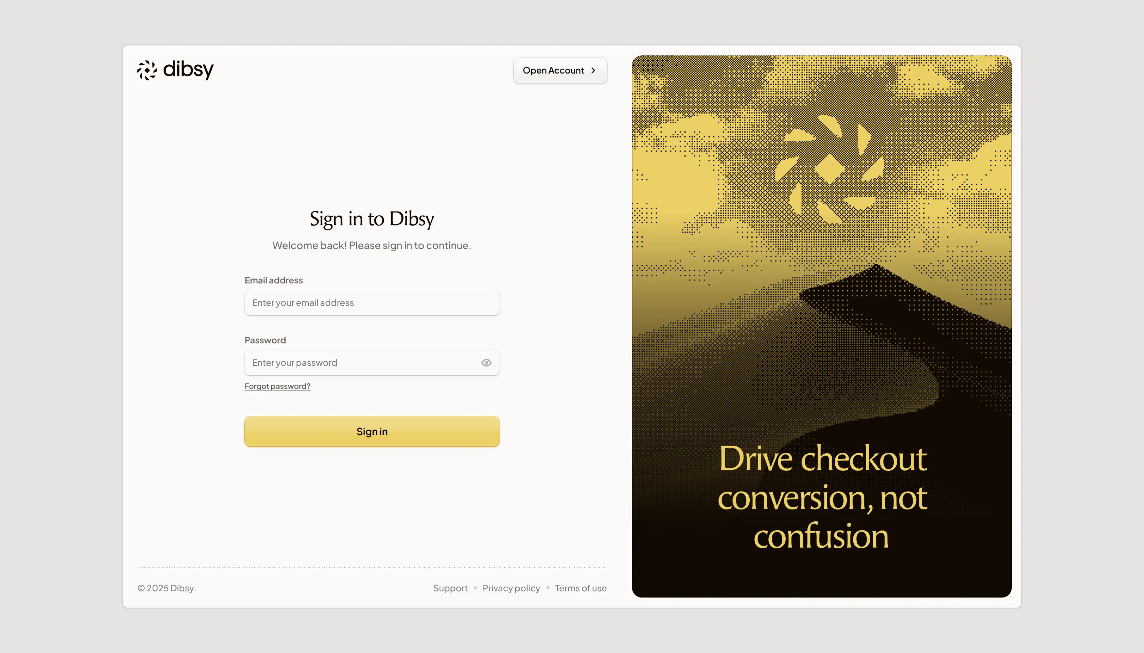
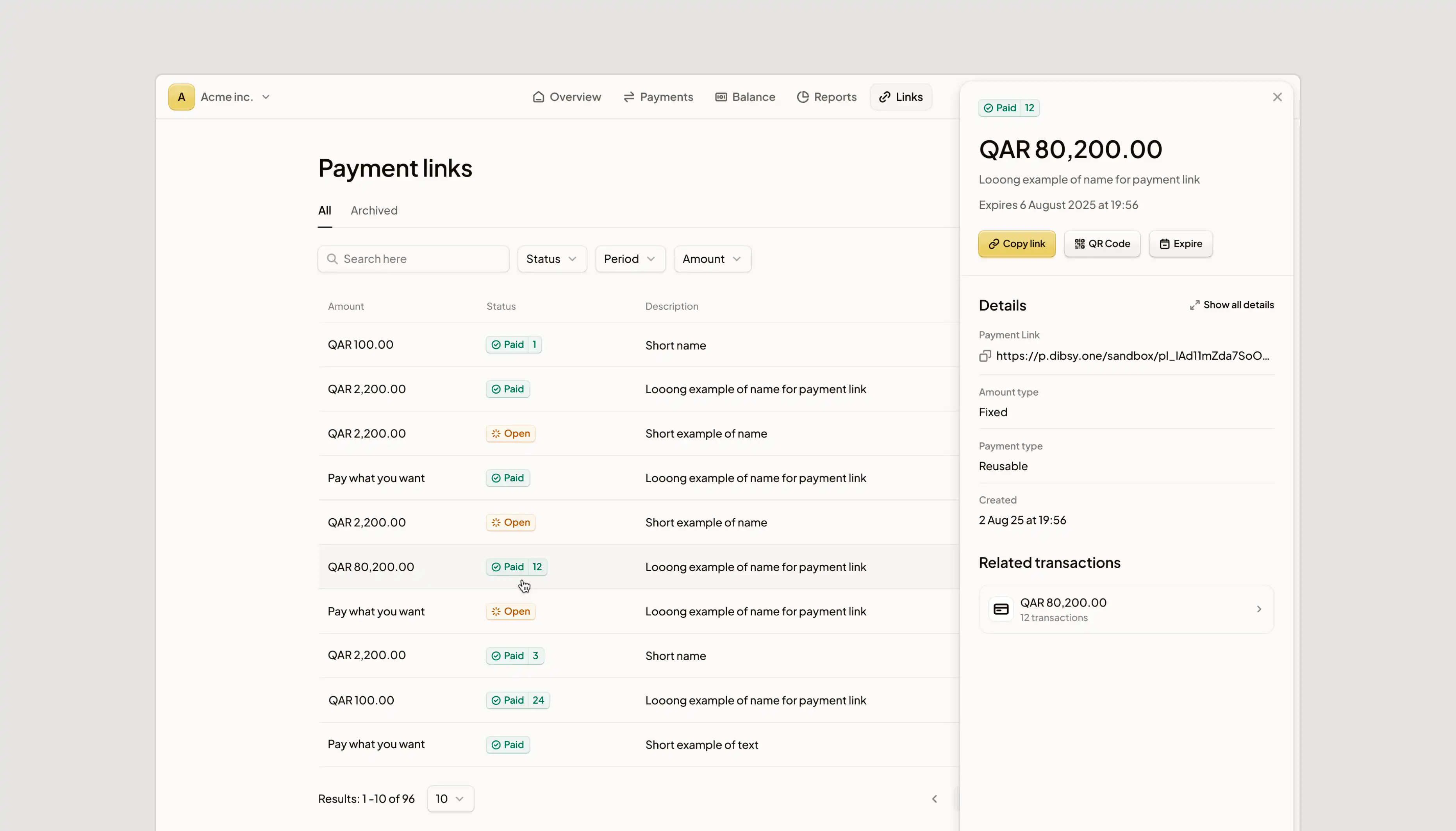
Dibsy is a Qatari fintech building modern payment infrastructure. I crafted a premium brand identity inspired by Qatari heritage, its landscape and cultural patterns. I redesigned their web platform and POS UI from scratch.

Long story short
Dibsy is a Qatari fintech platform serving both consumers and major enterprises. The team came to me for a complete brand refresh and a redesign of their user platform. They wanted something credible and premium - a look that earns trust with enterprise buyers while genuinely honoring Arabic visual culture, not decorating with it.
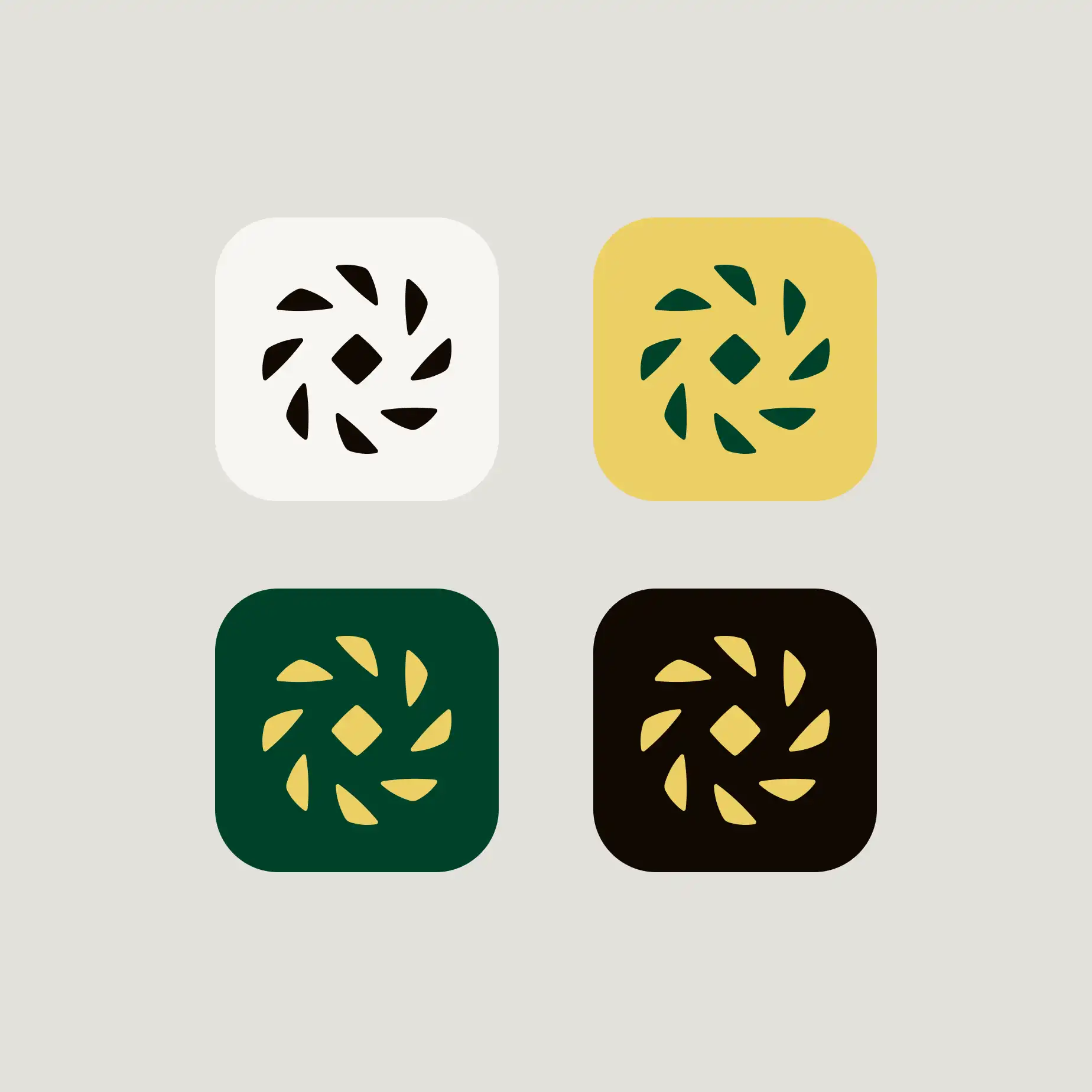
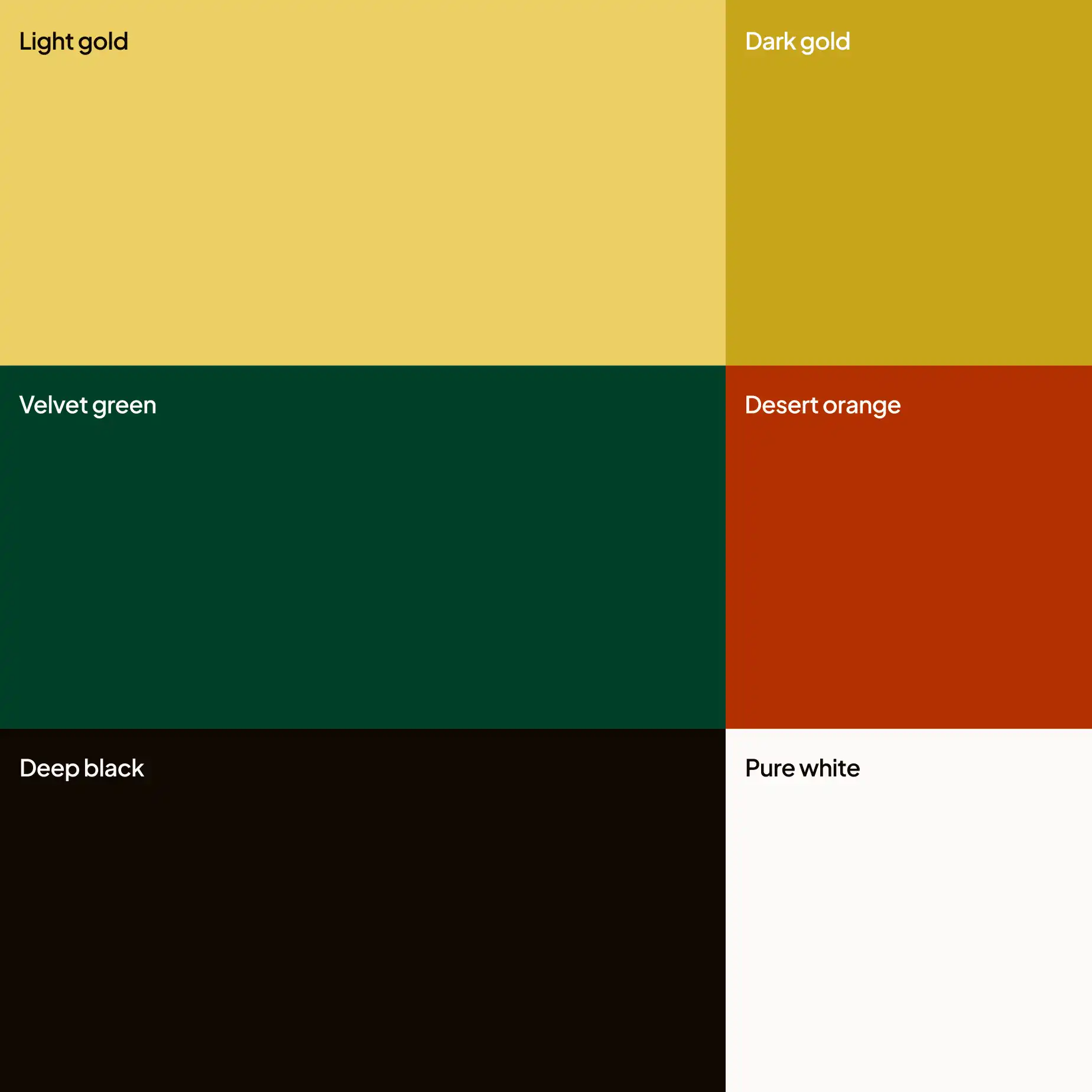
So the project started with research: Qatari history, architecture, and visual tradition. From there I explored several directions and aligned with the team on a concept built from natural desert landscapes and traditional Qatari pattern. That became a core for their full identity - new modern logo, custom patterns, icons, illustrations, and bilingual typographysystem engineered to work across Arabic and English at the same weight, all documented in a complete brand guide with marketing collateral.
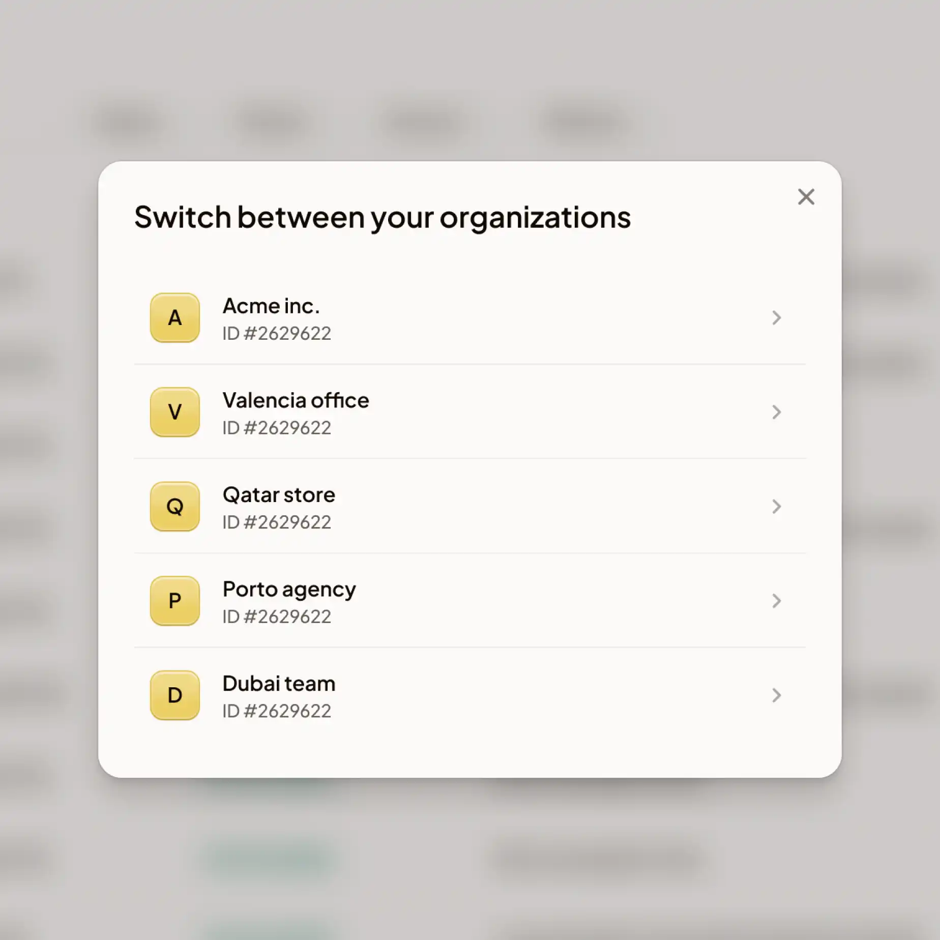
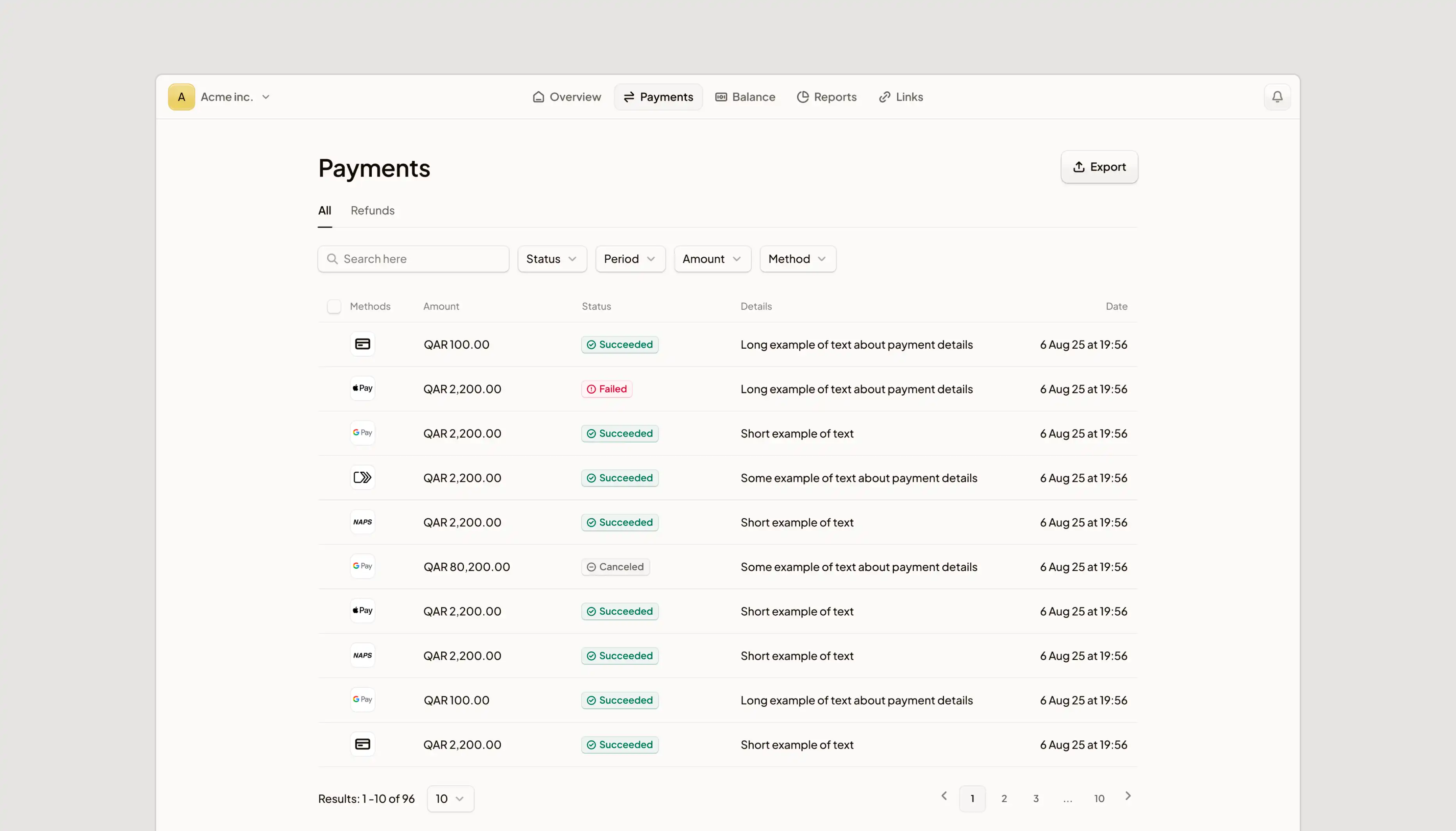
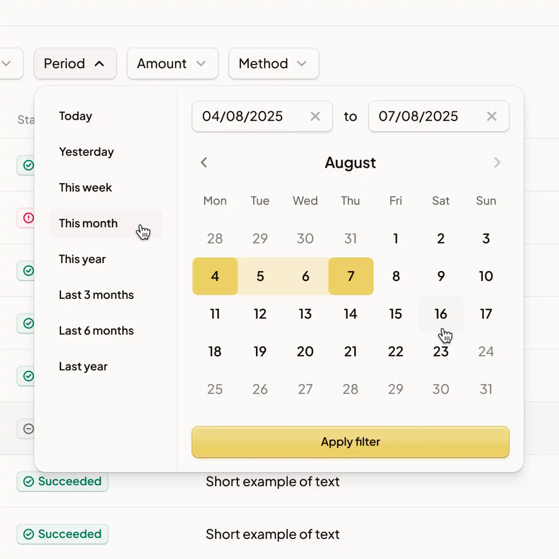
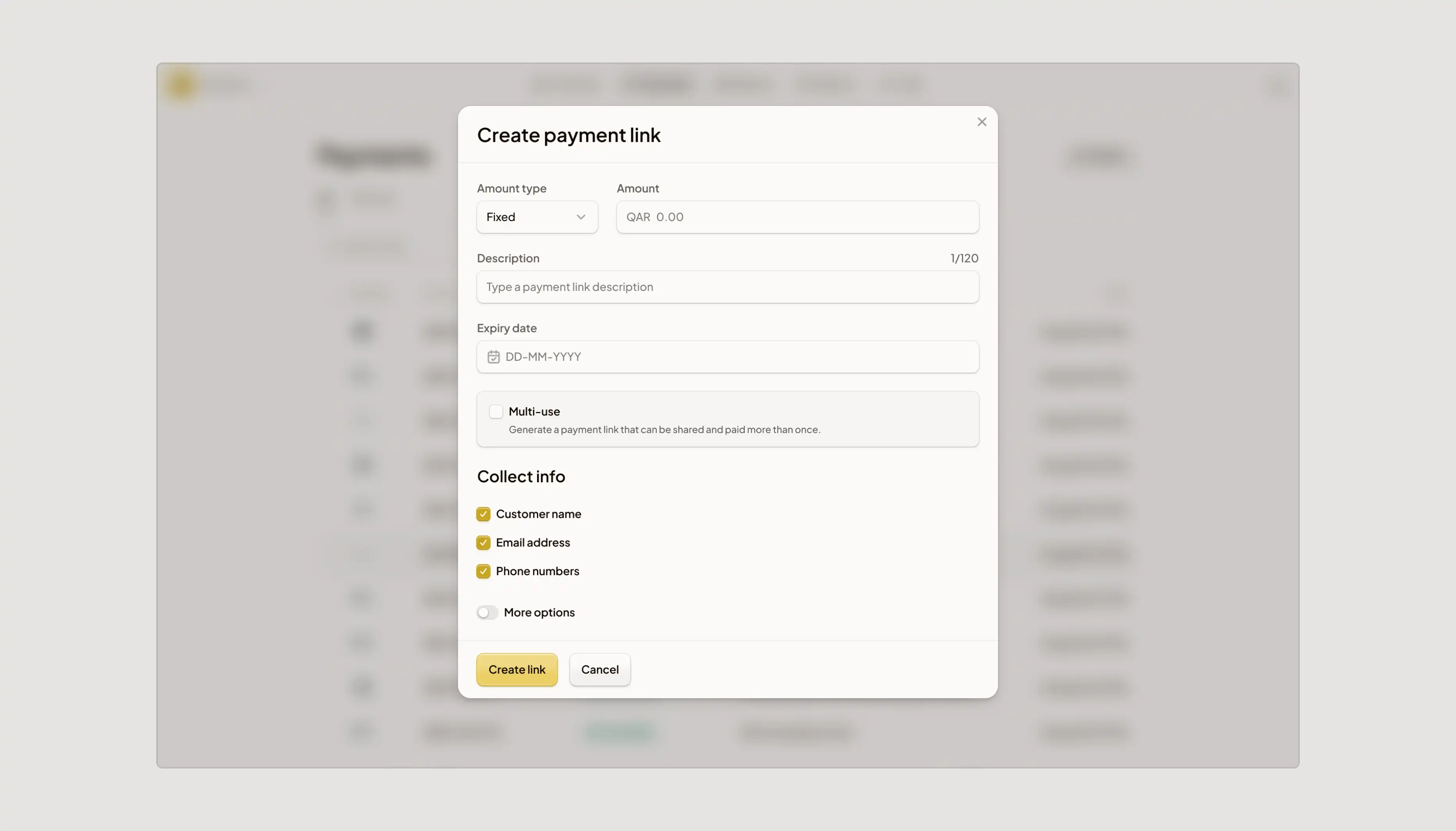
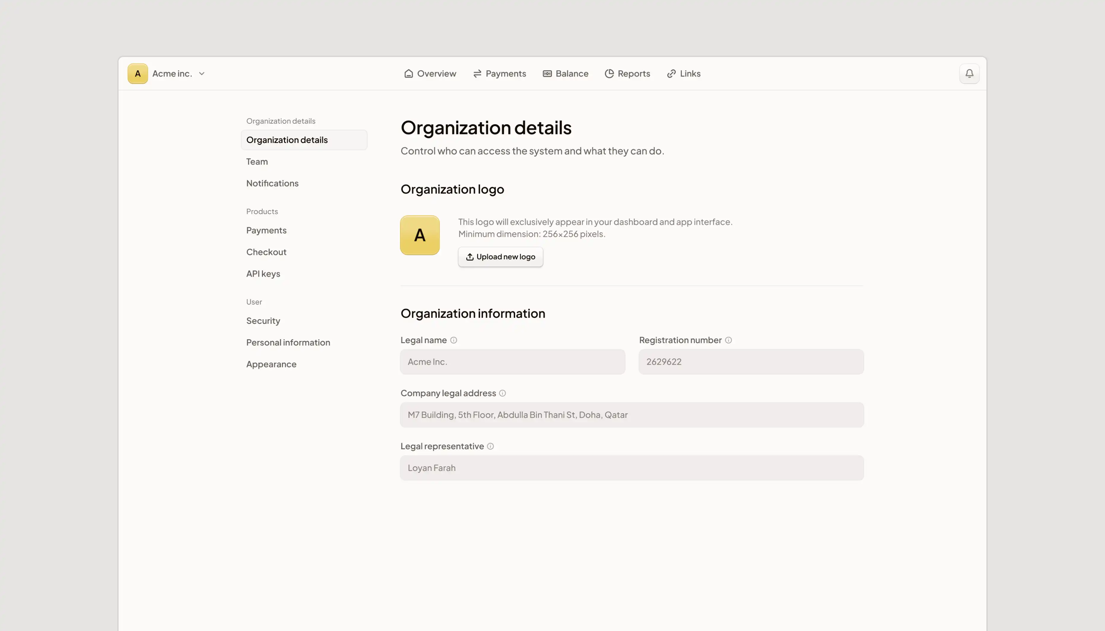
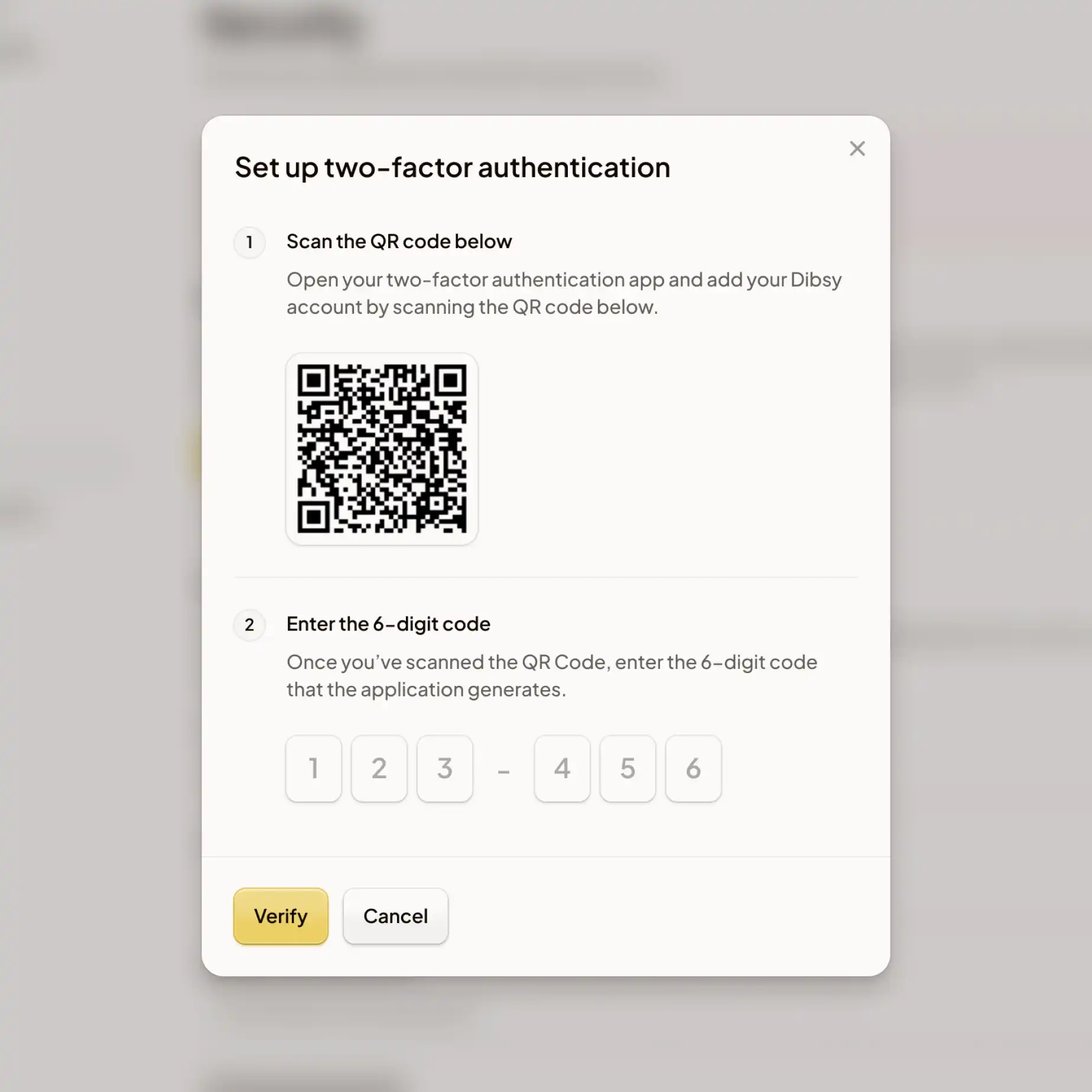
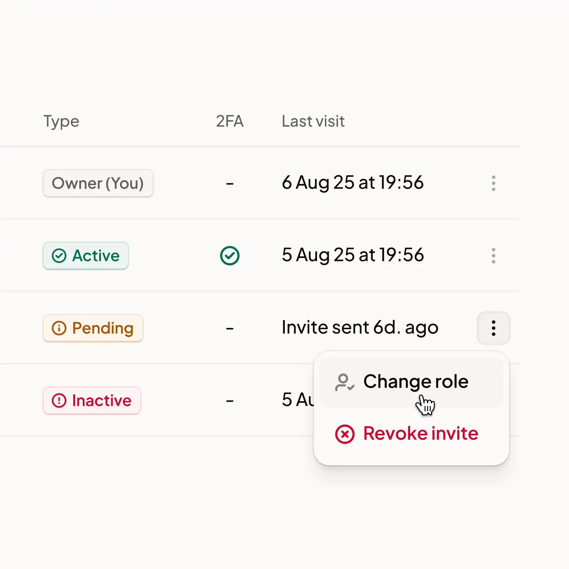
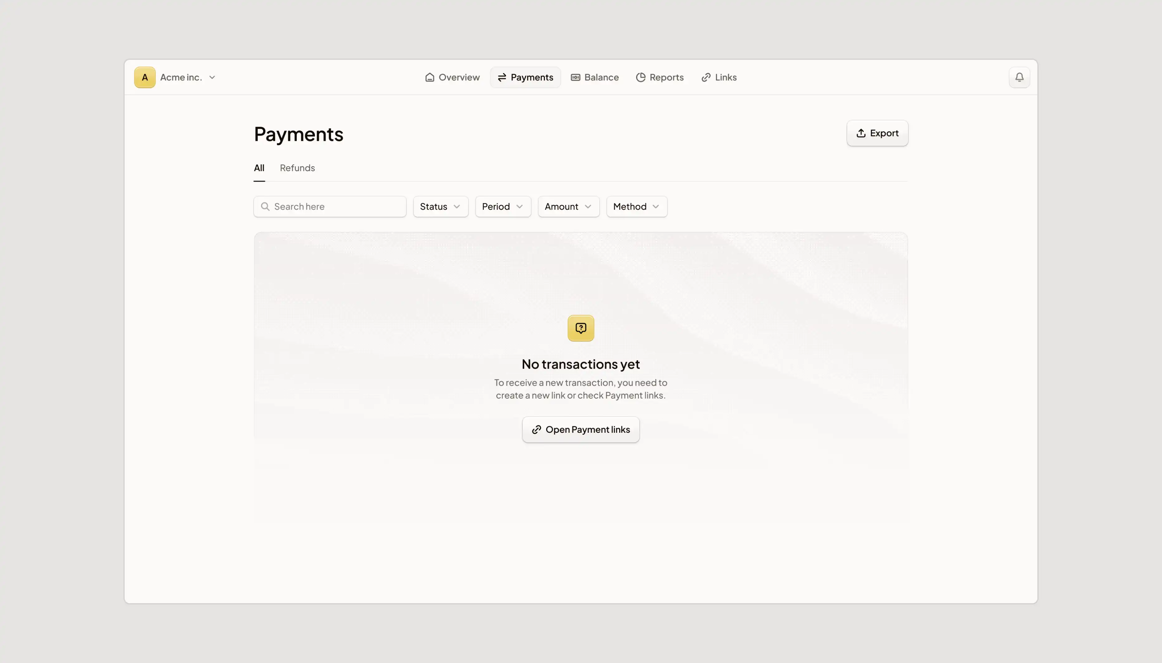
Then I extended the system into the platform itself, replacing the legacy interface. Redesigning core user flows in a bilingual, right-to-left product is where most design systems quietly break, so I worked in close sync with Dibsy's team and developers to keep every decision intuitive, scalable, and actually buildable.
The result was identity that doesn't look like any other payment gateway in the region, and a platform their customers can move through quickly without thinking about it.
Services
logotype
brand research
brand guide
mood boarding
ui/ux research
icons & illustrations
web platform design
design system
Tools
figma
claude
chat gpt
illustrator
photoshop
after effects
my brain
Branding








Web platform